What is the main header? #
As the first thing a customer sees on your e-commerce site, the header is crucial to the brand experience. The Nature allows you to choose multiple layouts and options by offering scrolling and transparent design options and several header styles.
Here are the example header layouts.


How to set up the main header section #
- Open the Theme Editor and add the Main Header section to Header area.
- In General settings, please choose the options if you want to enable the transparent header and sticky header or not.
Note: The transparent header only works on homepage.- Choose the options of the Container width and Color scheme and choose an option of the Header layout which you like.
On mobile, the position of the humburger menu icon can be changed by Mobile menu icon position.
You also can set the icon size on the header section and each icons will have the same sizes.- Now in Logo settings, you can upload your logo and mobile logo(if you want the different logo on mobile) and set the logo width.
- Choose the main menu in Main navigation settings and choose the Menu alignment option.
If you want to show the different color link, then you can use the Featured link option. The color of the Featured link will set as accent color of the Color scheme.- In order to add a search icon to Main Header, you can simply tick on the Enable search option and set the option whether you hide the search icon on mobile or desktop.
- As a secondary navigation on Main Header, you can use the Quicklinks.
Whether you like to show the Quicklinks with Main menu or Icons, you can choose the Quicklinks position and the Menu for Quicklinks.
In addition, you can add a CTA button to the quicklinks navigation and it depends on your mind. You can choose a CTA Button icon and Button label.
Note: Cart icon and the links for each social icons are set in Theme settings -> Cart and Theme settings -> Social media.
Mega menu setting #
The Main header section has two type mega menu blocks, Column Mega Menu and Tabs Mega Menu. Each mega menu types are different layout and options, and also should be connected with the top menu links.
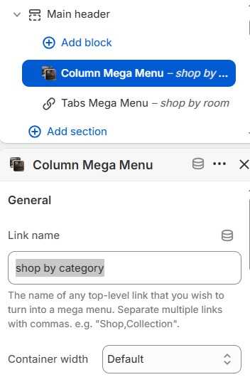
The connection between the top menu link and mega menu block is set in block settings -> Link name option. The link name should be the lowercase string of the top menu link to be connected, such as shop by category.
Note: Each child navigations in mega menu blocks are from the Main Menu navigation of the main header setting.
Column Mega Menu #
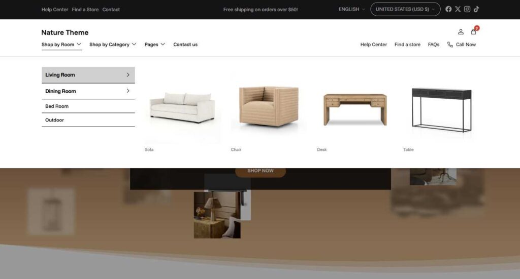
Here is the screenshot of the default column mega menu.
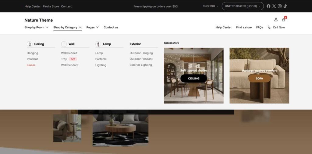
From the above screenshot, the right one(which has the heading “Special”) is “Promotions” and the left one is “menu blocks”.
On the block settings, you can choose the settings for Promotions and Menu block. Here it is how each settings will work on the mega menu.
- On General setting, you will set the link name to be connected and color scheme of the mega menu.
- On Layout setting, you will set the container width for mega menu and menu block width, and also can set how much columns the menu.
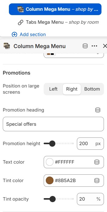
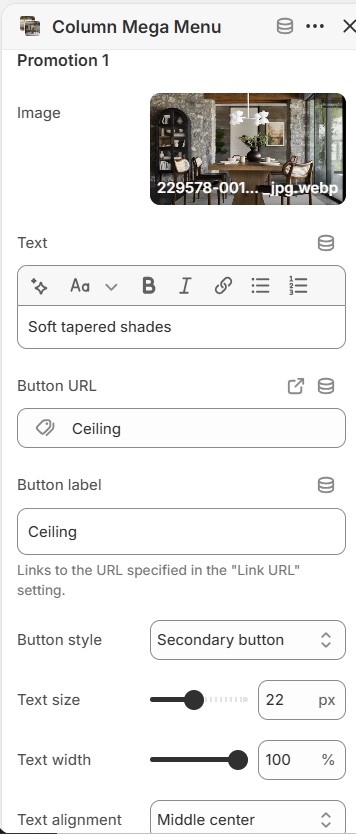
- On Promotions setting, you can set where the promotions will show on the Mega menu block, such as Left, Right or Bottom.
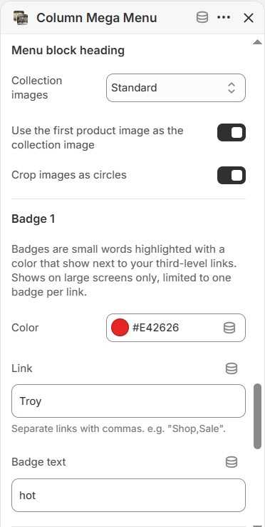
Each promotions will have the equal heights, the promotion images can have the same tint color and opacity.- On Menu Blocks setting, each heading menu items can have an image if it’s a collection link, and you can config the options for the image.
Regarding the child menu items, you can add a badge of highlighted word and it will attract
Tabs Mega Menu #
The above screenshot is how the Tabs Mega Menu block works on the header section. The mega menu items come from the second and third level menu items of Main menu in header setting and the second level menu items will work as Tab links and the third level menu items will work as Tab content links.
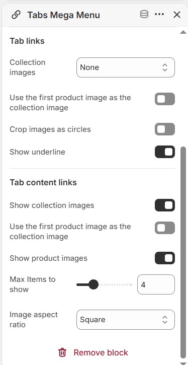
On Tab content links, the child menu items can show the featured images if the items are collection menu items or product items. You can choose the image aspect ratio and they maybe cropped unless you choose “Natural” option.